For each plot type, a number of settings can be adjusted, either to manipulate the plot to help explore specific features or to modify the appearance to generate a publication-ready image to export. Some of these settings are shared across plot types, while others are plot-specific.
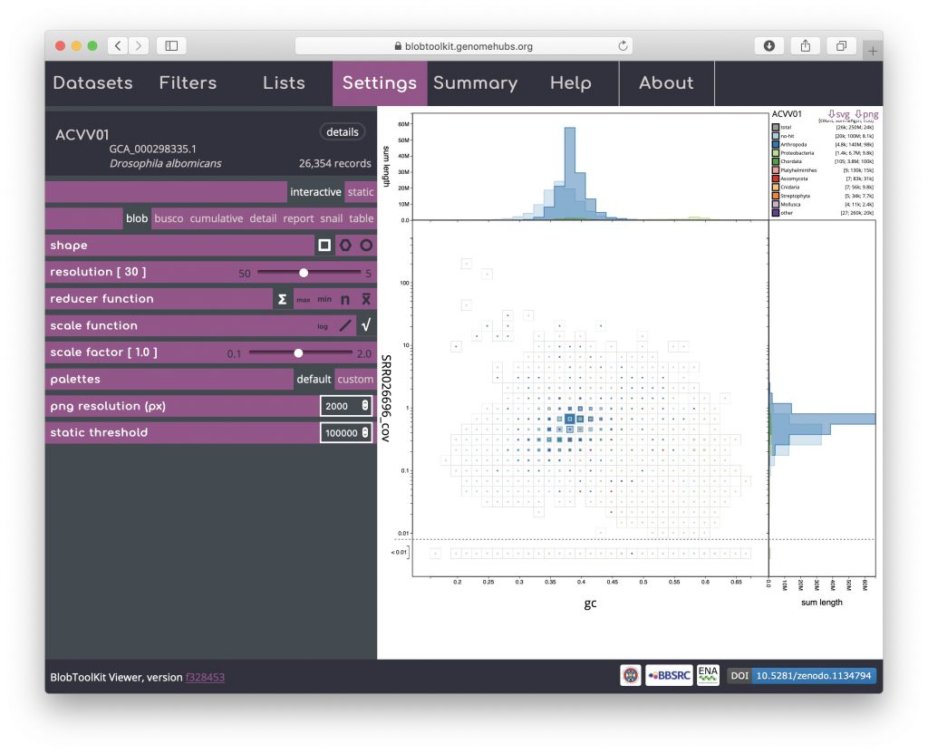
Plot settings can be accessed by opening the Settings menu. Blob plot specific settings include shape, resolution, reducer function, scale function and scale factor:
Use of the plot shape parameter is discussed in Exploring views.
The reducer function determines how the values (sequence lengths) for each category in each bin are combined to produce the single value that is scaled in the binned plots. The default is to sum all the values, but alternative functions use the minimum value, the maximum value, the count (number of sequences) or the mean of all values. The scale function determines how these values are scaled and applies to both binned an non-binned (circle) blob plots. The default is square-root so the area is proportional to the value, while alternative log and linear scale functions increase or decrease the prominence of small values, respectively. Setting the reducer function to count and the scale function to log scales highlights the number of scaffolds in each bin:
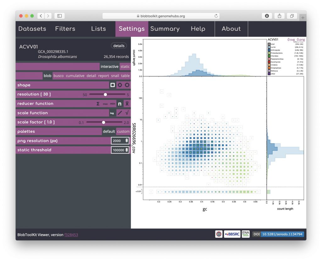
Here it is clear that the light blue and dark blue areas of the plot overlap, while there is a distinct area coloured light green. Dark blue represents Arthropoda and, given that this dataset is based on a Drosophila albomicans assembly is likely to originate from the target organism. Light blue represents scaffolds with no sequence-similarity hits to taxonomically annotated sequences in the public databases. Given the overlap, this is likely to mostly reflect Drosophila albomicans scaffolds that were too short to have hits in the databases, or Drosophila-specific sequences as Drosophila sequences were masked when running the BLAST searches. In some cases the presence of a distinct blob in addition to the target organism would reflect contamination. Here the light green represents Proteobacteria so this region of the plot is likely to reflect a Wolbachia endosymbiont.
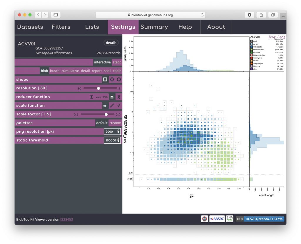
Changing remaining parameters can be useful for identifying features, though for this example dataset may not be necessary. Increasing the scale factor can make the regions in the plot more “blobby” by setting the maximum size of a square to be greater than the bin-size, allowing adjacent bins to overlap:
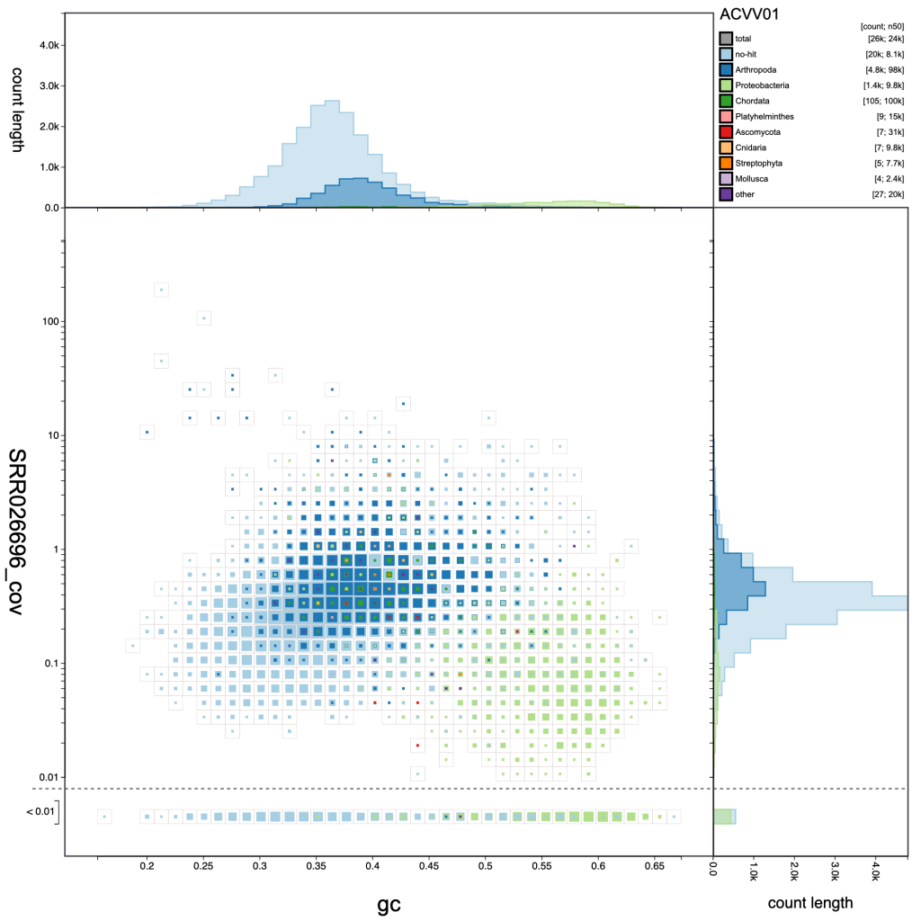
Adjusting the resolution changes how many bins the x– and y-axes are divided into. Increasing the resolution may help to see the division between overlapping blobs or to identify bimodal distributions associated with heterozygosity. Reducing the resolution masks fine-scale patterns but makes selection of plot regions easier (see Using selections):
resolution: 40 
resolution: 30 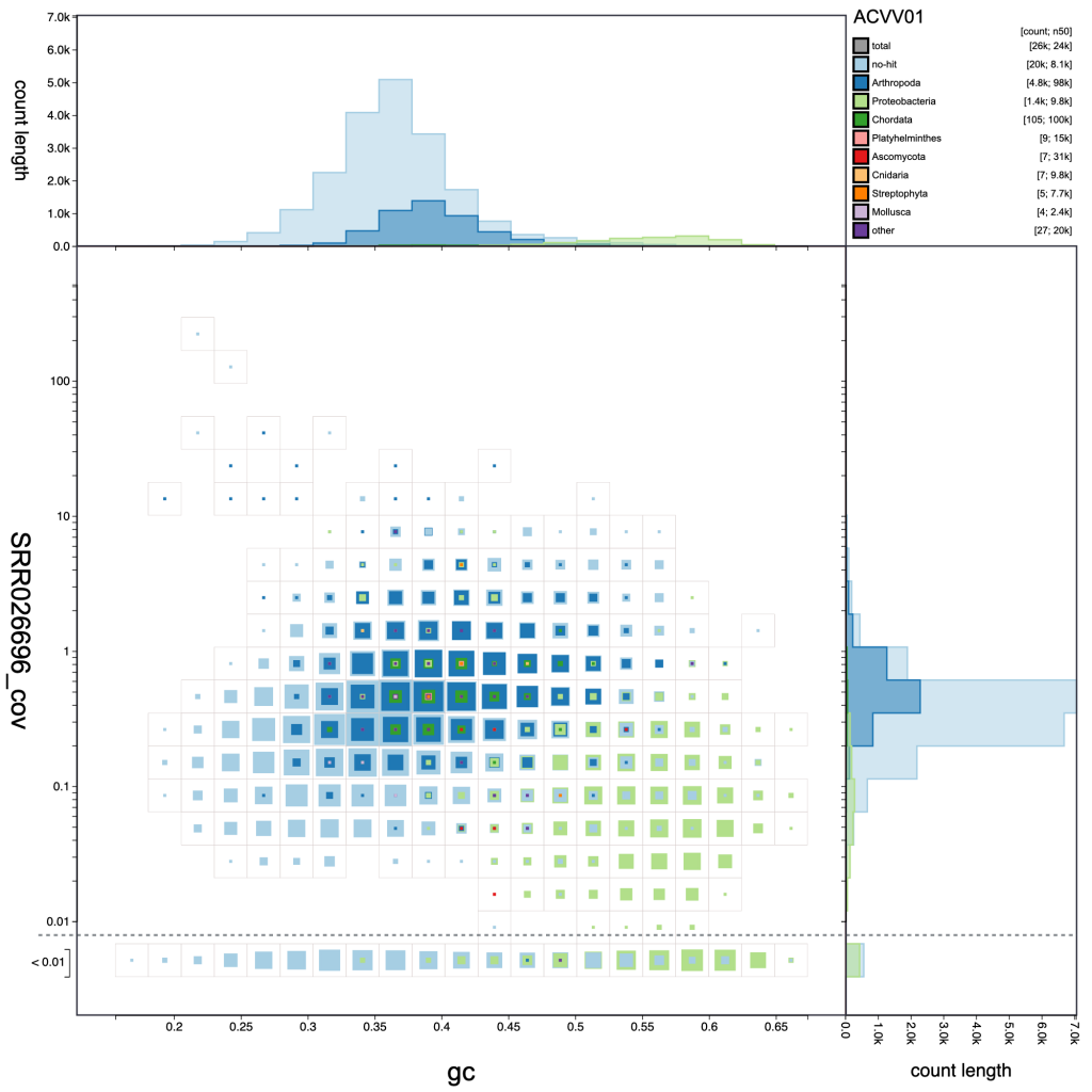
resolution: 20
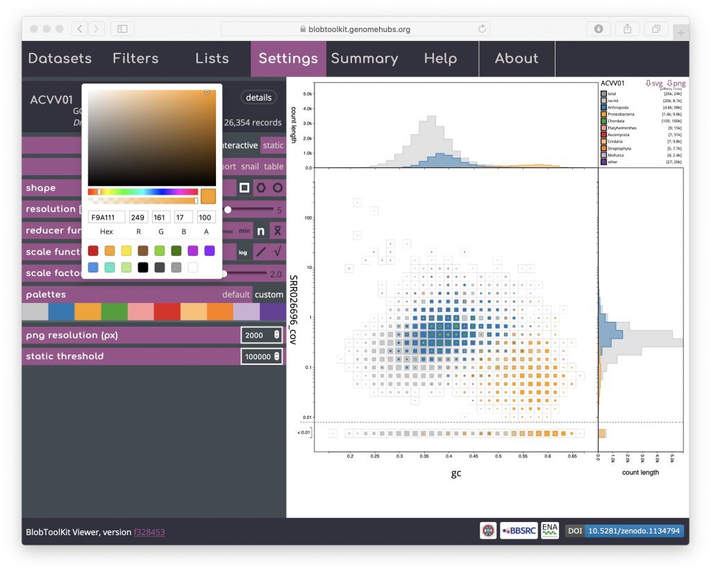
Palettes are shared across multiple plot types. The default is based on a Colorbrewer palette. Colours can be changed by selecting the “custom” value for the palettes parameter then clicking on coloured swatches to adjust the colours assigned to each category:
If adjusting the palette to produce an image for publication or on a poster, note that you are able to set the resolution of exported PNG format files by setting the png resolution (px) parameter to the width of image you wish to export.
The static threshold parameter is used to set the maximum size of dataset that will be displayed interactively. With the default setting, pre-rendered, static images will be displayed in place of the interactive views for datasets with more than 100,000 scaffolds to accommodate users visiting the site with relatively low-powered devices. To view large datasets interactively, either increase this value or click the “interactive” button at the top of the SettingsI menu (see Viewing large datasets).
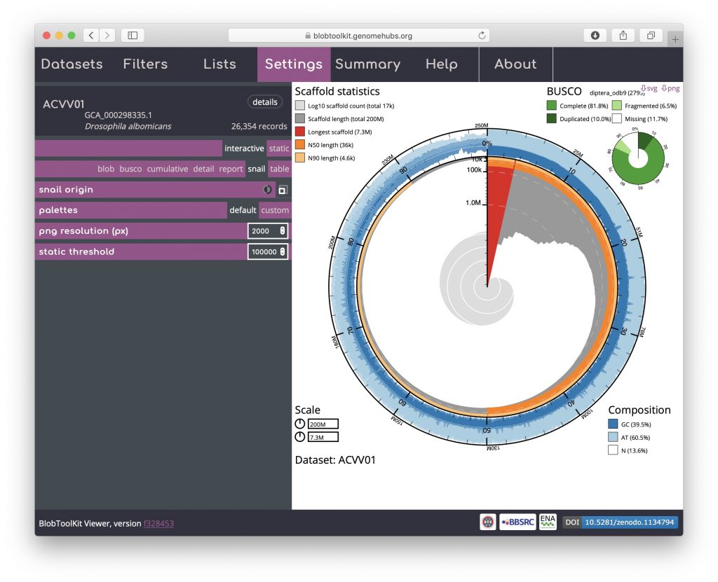
An additional option that is available for both the cumulative and snail plots it the option to scale the plot to the current filtered dataset (see Filtering assemblies). This is presented as an icon under the curve origin or snail origin parameters and adjusts the maximum axis values to match the values for the filtered dataset rather than the complete dataset. This can make the plots easier to interpret, particularly if a large proportion of the assembly has been filtered out. For a snail plot of a filtered dataset:
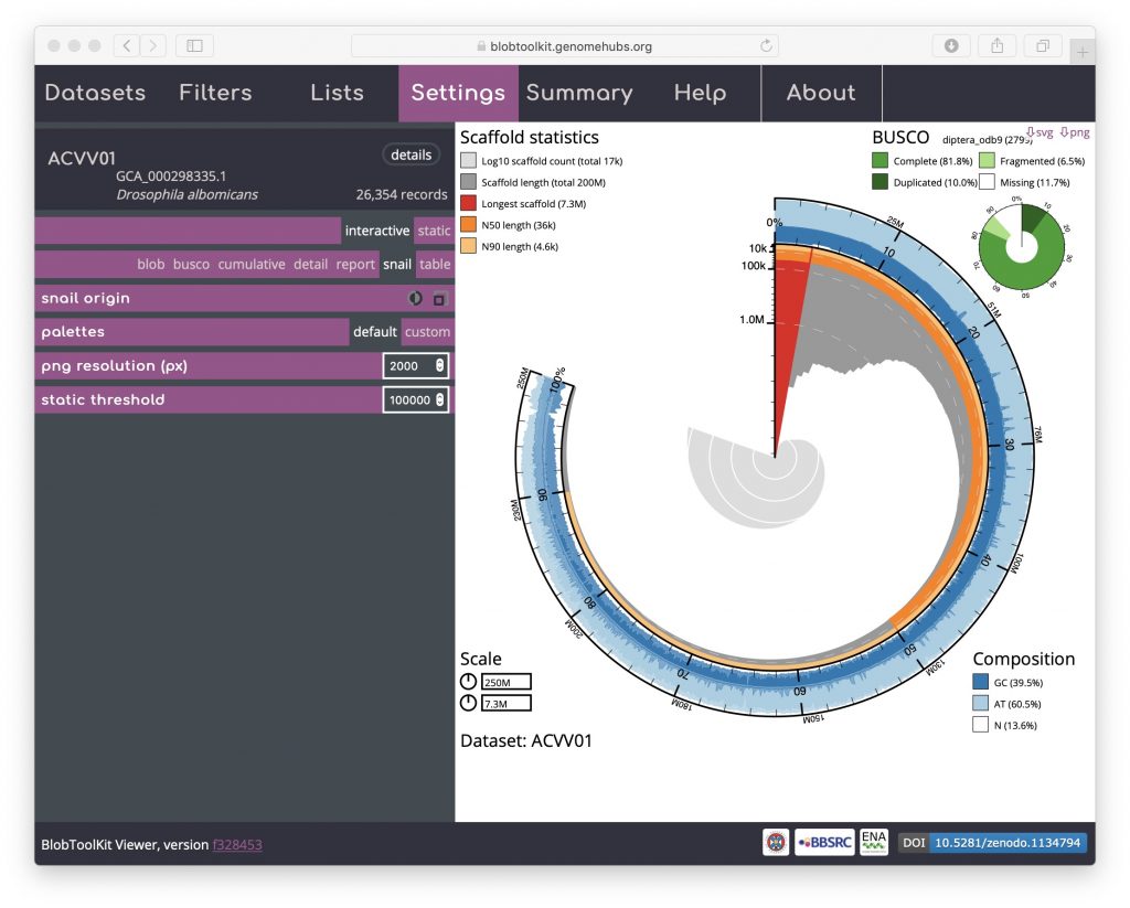
Toggling the snail origin scale icon ensures that the plot reflects the filtered dataset: